The Challenge
Funnelish, an eCommerce funnel-building platform, needed to enhance its UX and differentiate itself in a competitive market to increase user sign-ups, reduce bounce rates, and effectively communicate new features to online entrepreneurs.
The Solution
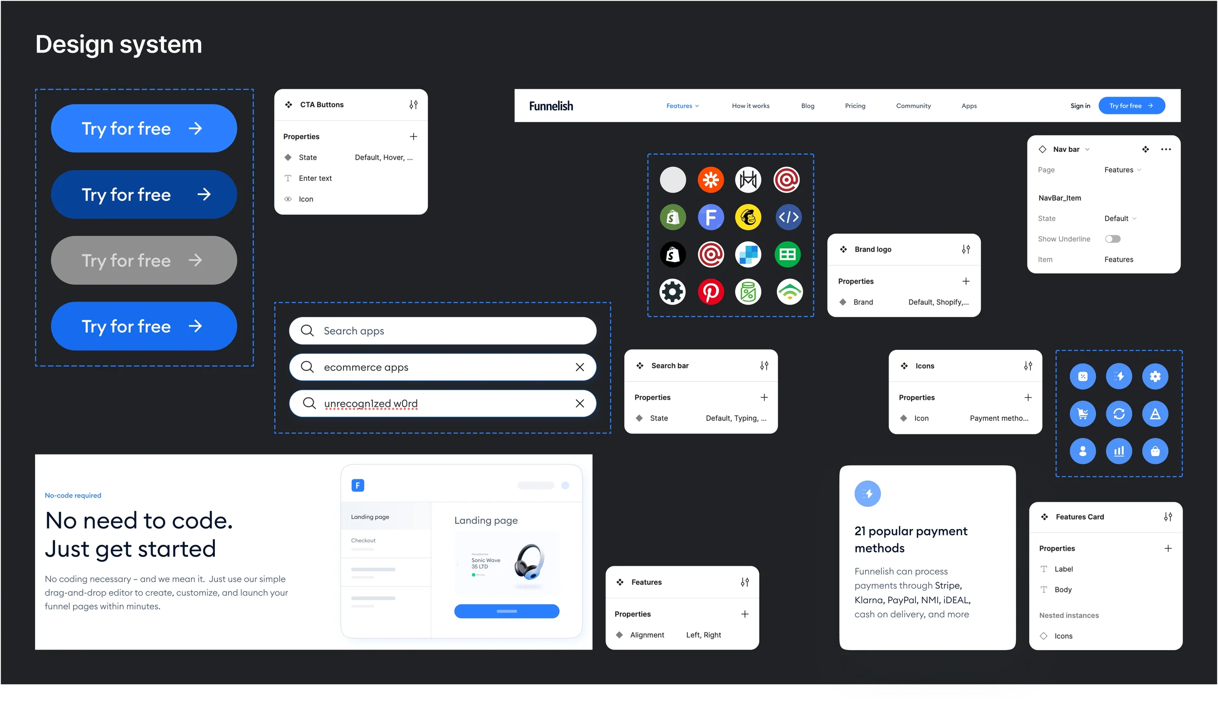
I redesigned Funnelish's website to improve conversion and user experience through intuitive navigation, streamlined information architecture, and a refreshed visual identity. The redesign introduced optimized content structures to showcase new features, simplified the sign-up flow, and developed clear messaging that positions Funnelish as the platform of choice for entrepreneurs building sales funnels.
My Role
UX/UI Design, Information Architecture, Brand Refresh
Product Goals
Launch a revamped website
Refresh the brand identity
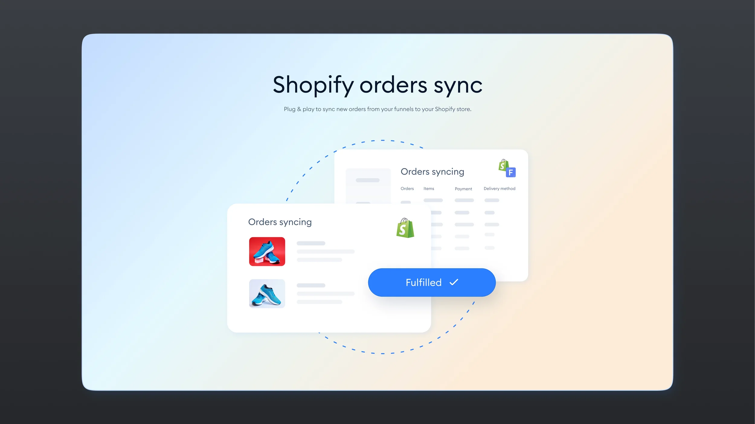
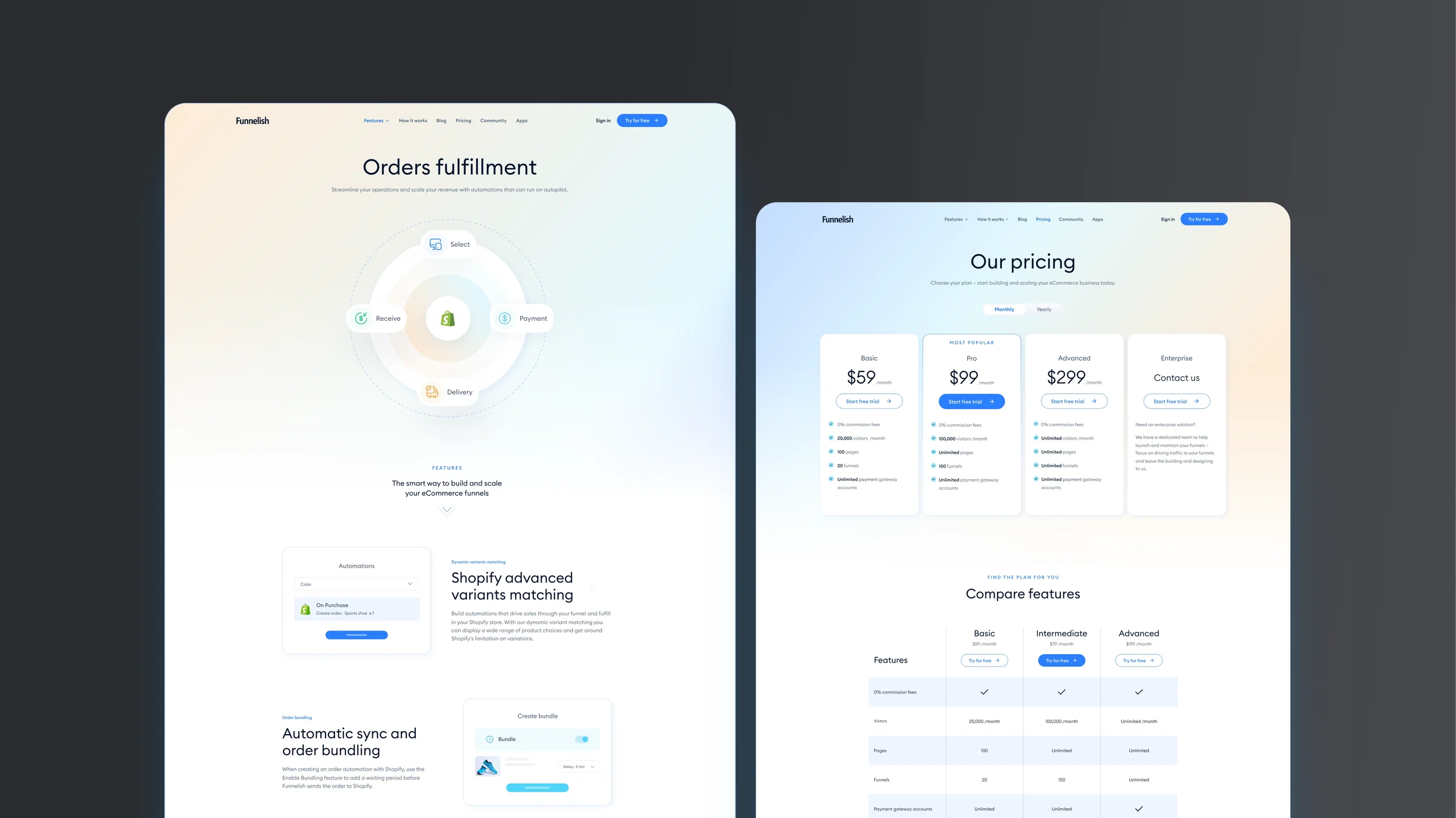
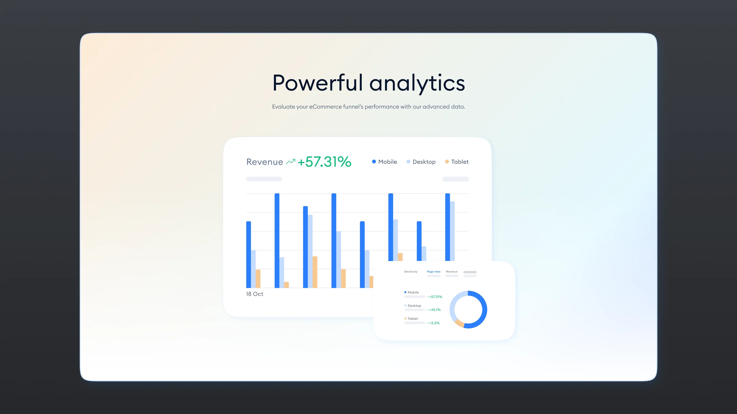
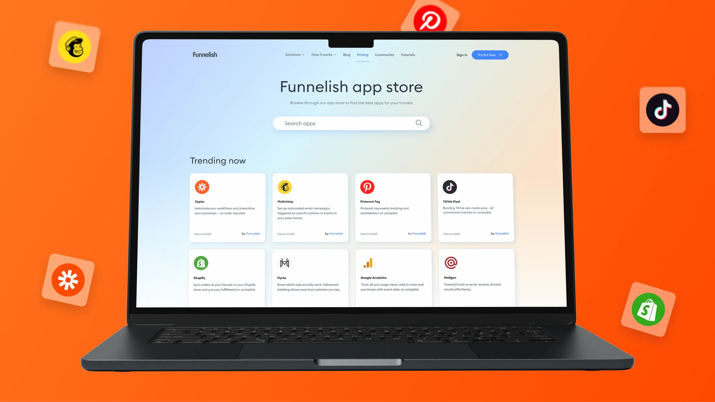
Highlight and promote new features
Develop a unique selling proposition (USP) to differentiate from competitors
Capture and convert leads
Streamline the purchasing process
My Impact
As the main designer, the website required a redesign to accomplish the following:
Increase user sign-ups and decrease bounce rates through enhanced user experience
Improve navigation by implementing a user-centric information architecture and intuitive menu structures
Optimize content to effectively communicate new features and functionalities
Foster a sense of empowerment among online entrepreneurs through intuitive design and functionality
Disclaimer
User testing for this project has not been done due to:
Time Limitation: Due to constraints in project timelines, dedicated user testing sessions were not feasible at this stage.
Restricted Access to User Database: Given our aim to attract new customers, our user database lacked entries for newcomers, resulting in limited access for non-membership users.
Design Process
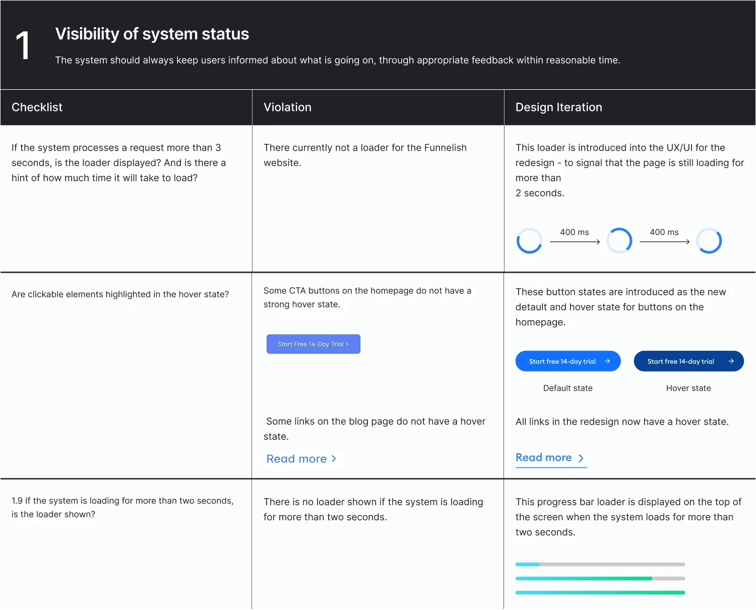
Heuristics Evaluation Audit
I conducted a comprehensive evaluation of the website using the heuristic evaluation framework developed by Norman Nielsen. Additionally, I employed a template provided by Adam Fard Agency. The third column serves dual purposes:
Design Iterations for adjustments I've implemented
Recommendations for future iterations
View more

View less
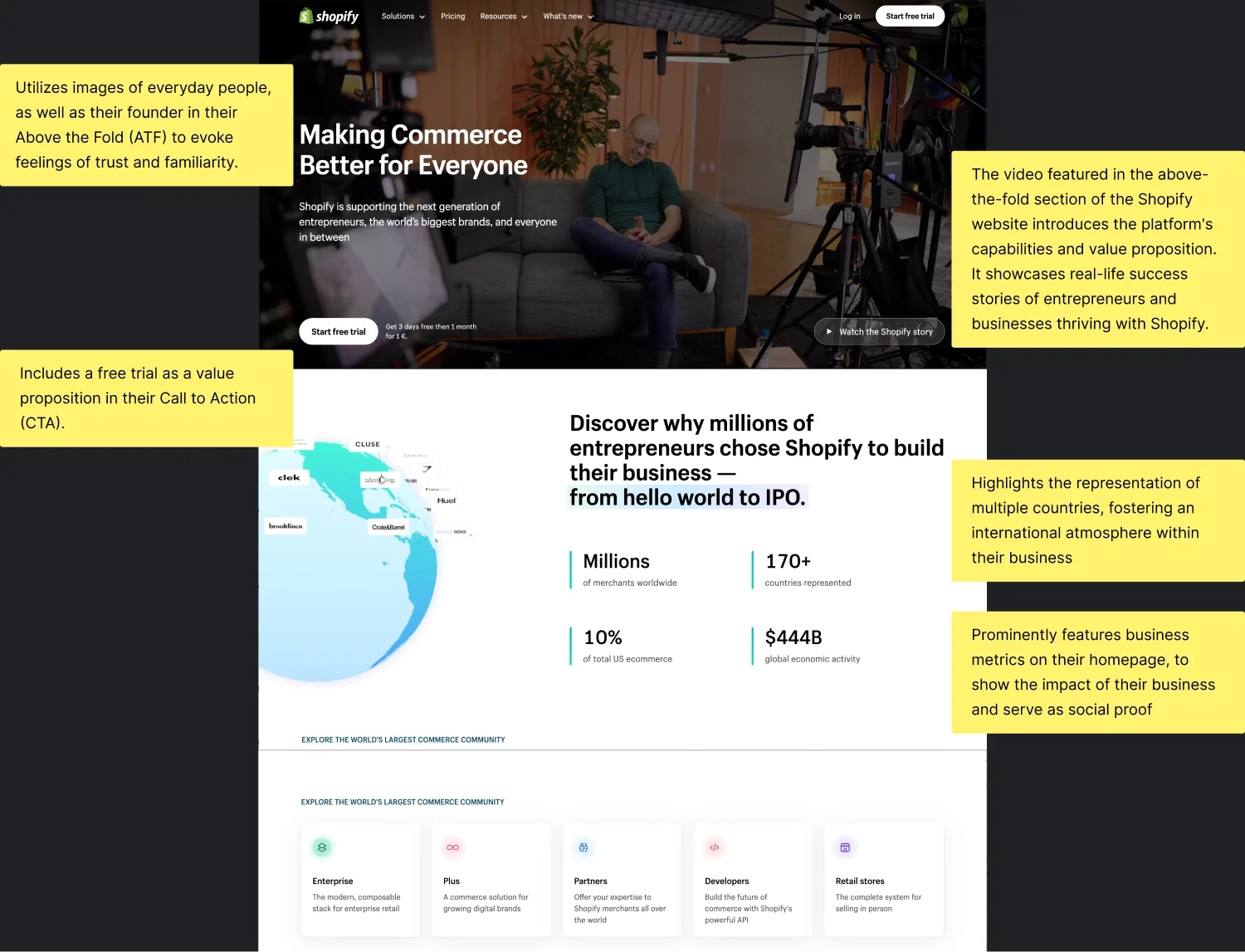
Competitor Analysis
I assessed various CMS platforms to understand their feature sets, user interactions, and content presentation strategies. Shopify, being a frontrunner in its category with over 7 million users globally, was chosen as the primary focus.
View more
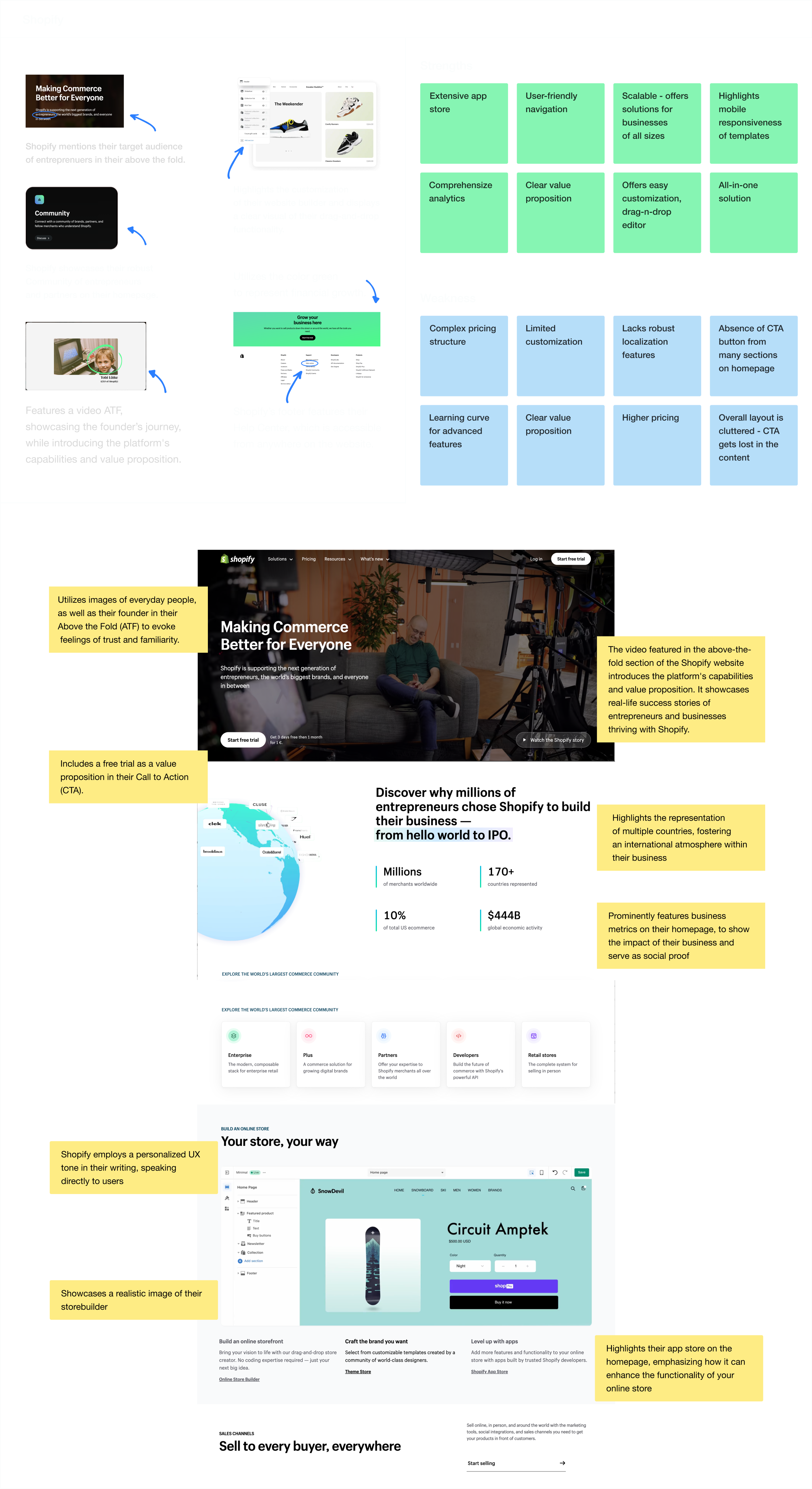
View less
User Flow (Happy path)
Successfully signing up for a free trial
I improved the user flow for signing up for a free trial by reducing the number of clicks, streamlining the form fields, and prominently displaying the CTA. The goal being to increase the engagement and reduce the drop off rate.
Click on the image to enlarge
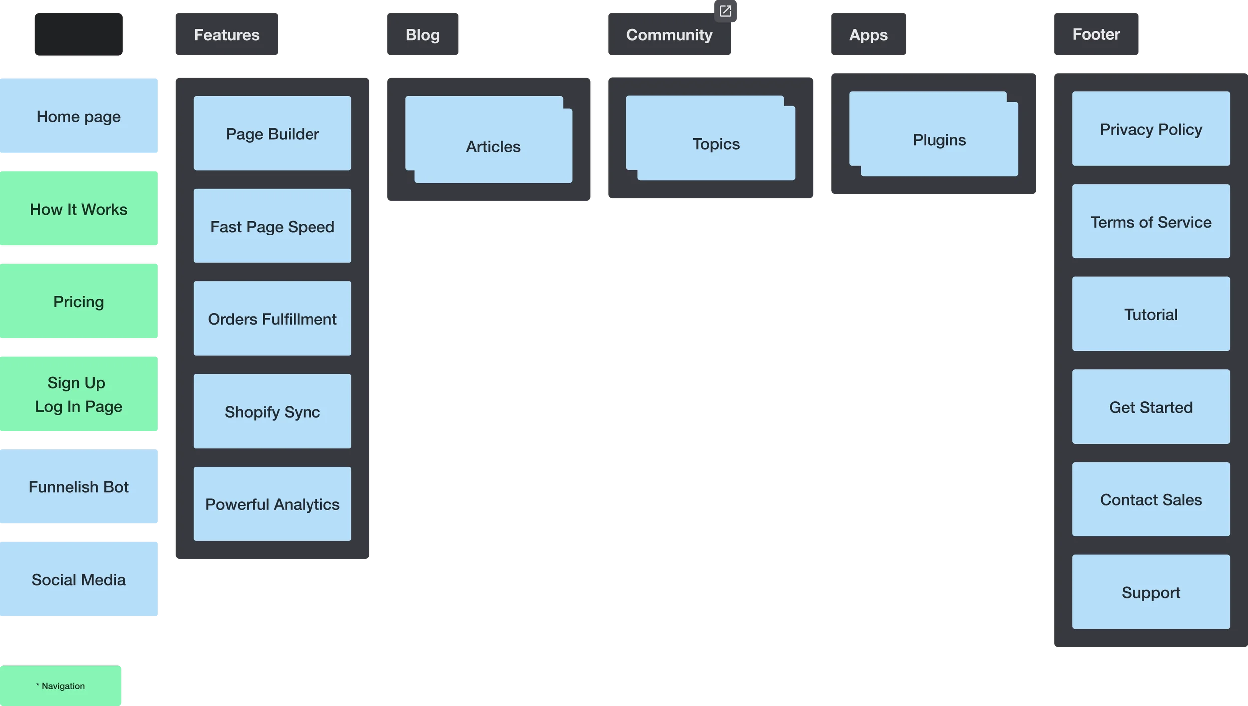
Sitemap
I utilized a sitemap to restructure the layout and navigation of the pages. This facilitated clear communication with stakeholders, ensuring alignment on the direction of the redesign and providing a roadmap for implementation.
KPIs
Analytics serve a dual purpose—not only for our clients but also for enhancing our product. To achieve this, I've defined Key Performance Indicators (KPIs) based on business objectives, strategic tactics, and segment identification. Although not yet implemented, these KPIs serve as benchmarks for future evaluation, including diverse metrics from user engagement to retention rates, and provide a roadmap for our product's evolution.