The Problem
The SoundCloud mobile app is confusing to use and lacks the individuality and personalized experience of the web version.
The Solution
I redesigned the mobile app to empower aspiring artists with new creation tools (in-app studio and recorder), a comprehensive Library section, streamlined navigation, and a bolder visual identity that makes key features intuitive to discover.
My Role
UX/UI Design, Heuristic Evaluation, Branding
Redesign Concept
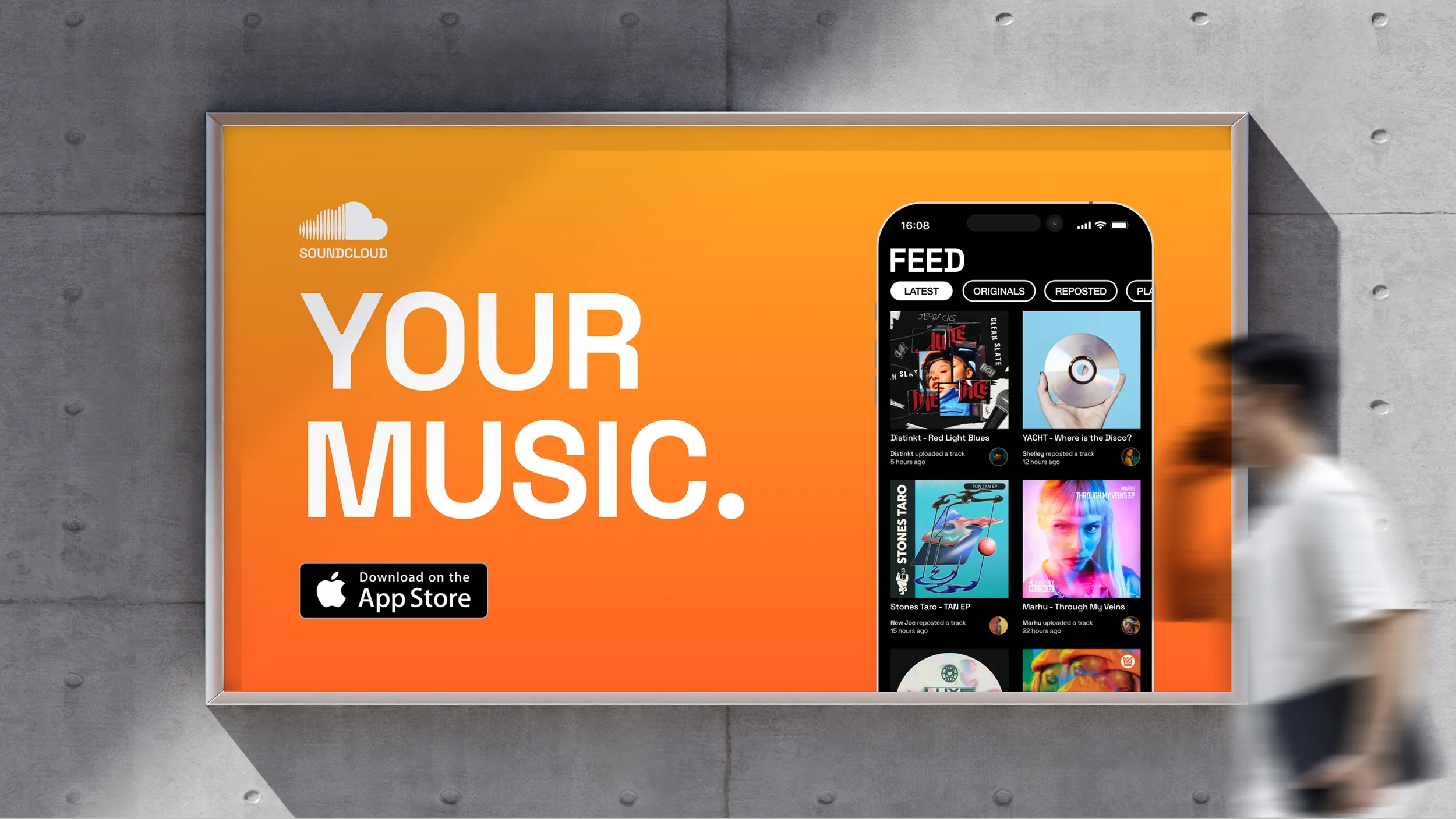
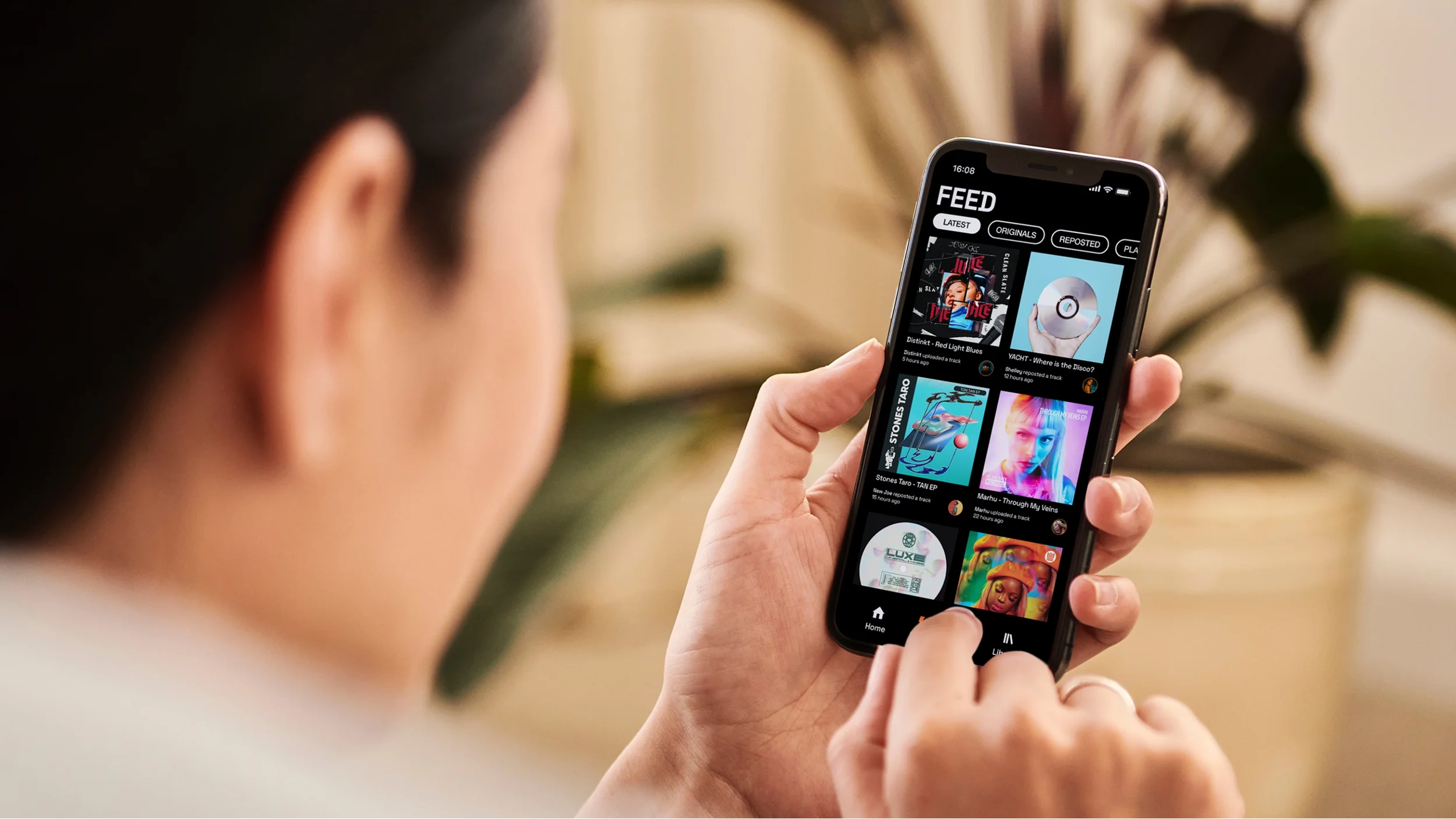
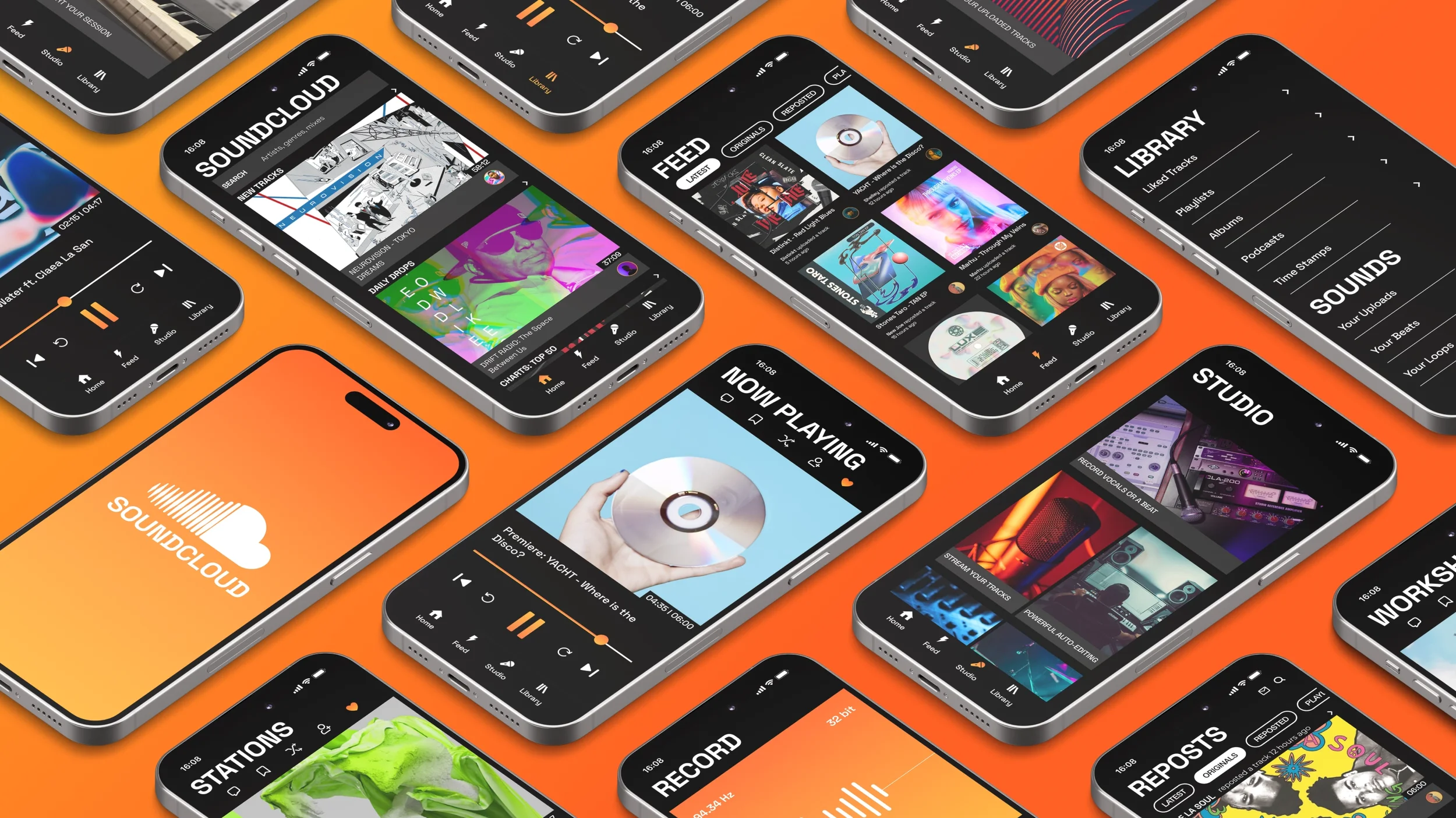
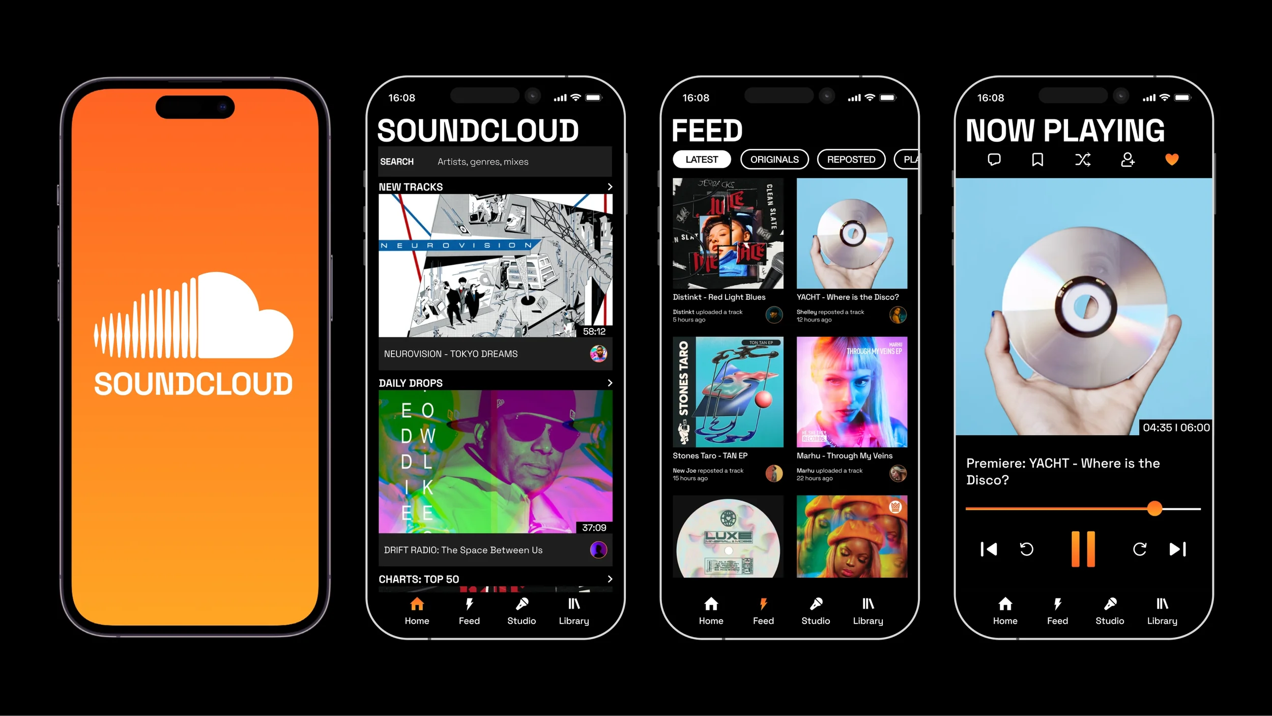
Bigger album covers on homepage having more of a Tik-Tok and YouTube style aesthetic, as their current album covers are too small and look like icons.
Instagram-style “stories” removed from top of homepage, as it wasn’t clear if they were original or reposted music content before clicking on them.
Layered shadows behind album covers removed as they felt cluttered and distracting.
Filters added to the top of “Feed” screen, helping to sort between original content and reposted content.
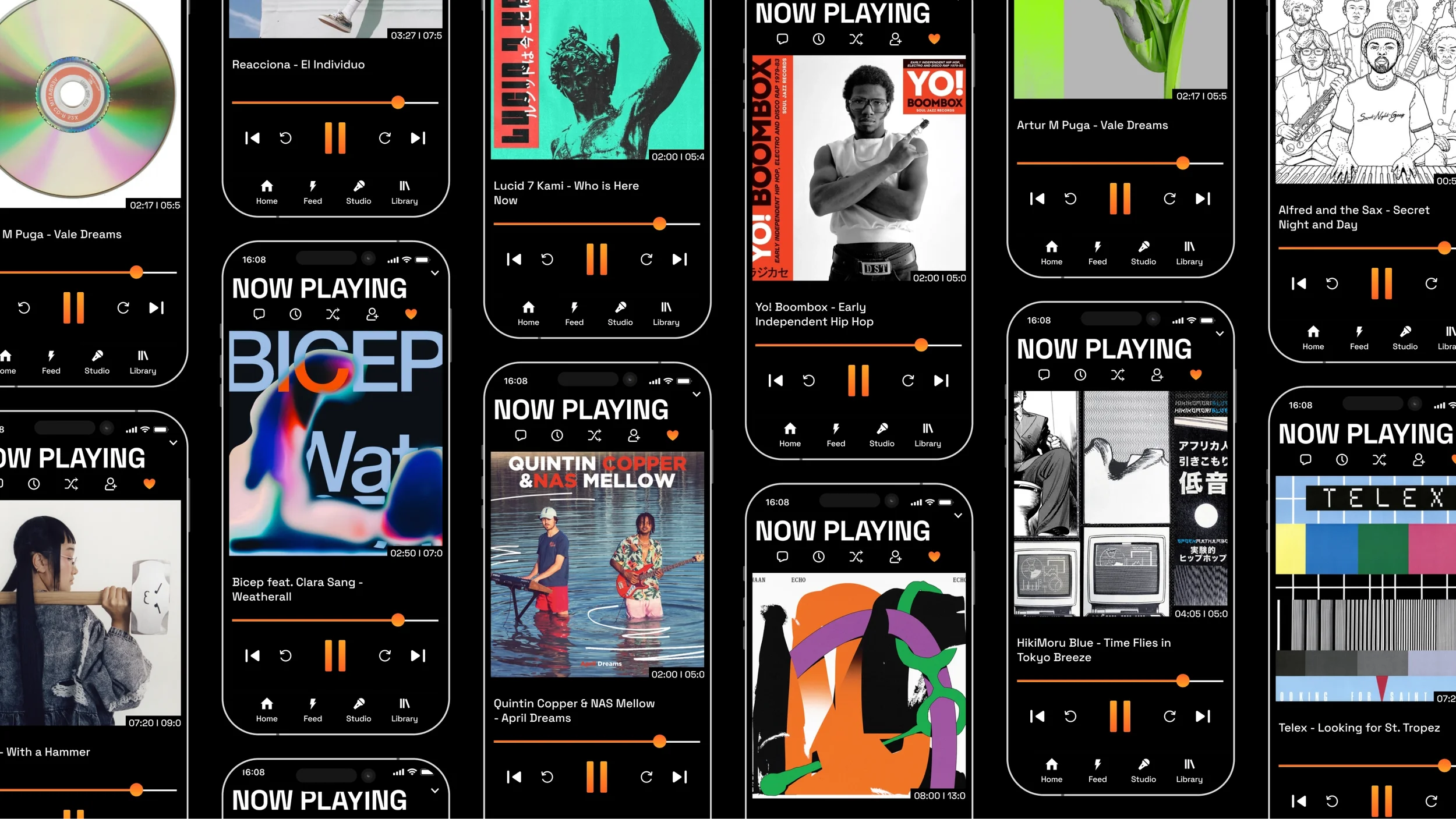
Music player in the dimensions of a square, showing the full artwork, as their current music player displays album covers full screen, cutting off parts of the artwork.
Full-width progress bar that makes track position easier to track.
New and Original Features
Time Stamp feature, represented by a clock icon, added to the music player - allowing you to time stamp/save certain points during a track while listening.
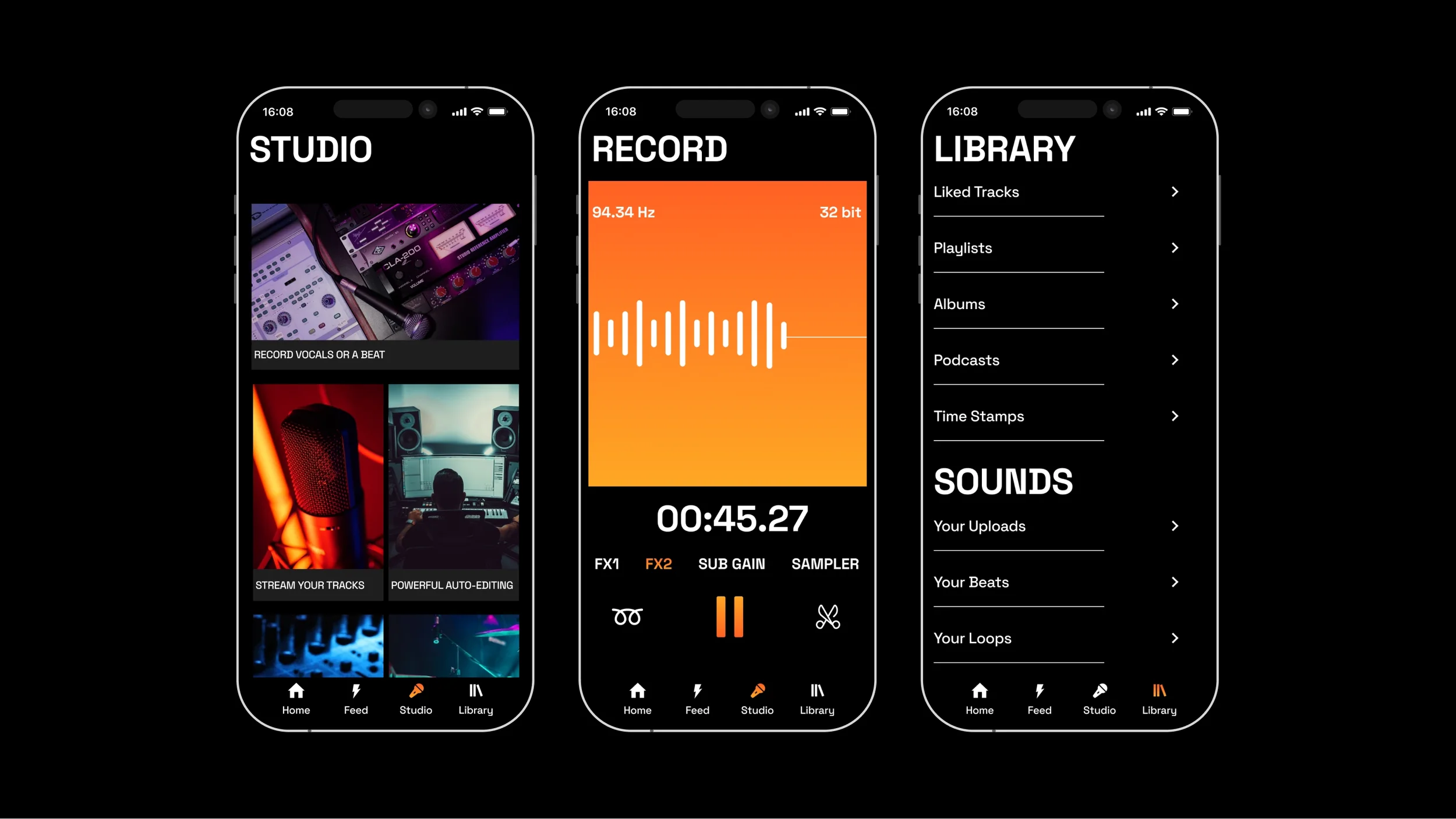
Library now includes a section for your “Sounds” that you can create in the app or upload through the web version.
Library “Sounds” including features, such as "Time Stamps," as well as "Beats" and "Loops," which can be created and saved from the in-app "Studio.”
Studio feature, which functions as an in-app music studio, adding more usability to the mobile app for music creators.
Record feature, included as part of the Studio, which acts as a built-in audio recorder, allowing you to capture field recordings or vocal recordings.
Audio editing capabilities within the record feature, including effects (FX1, FX2) such as reverbs and delays, as well the ability to loop or cut your audio recordings.
UI Decisions
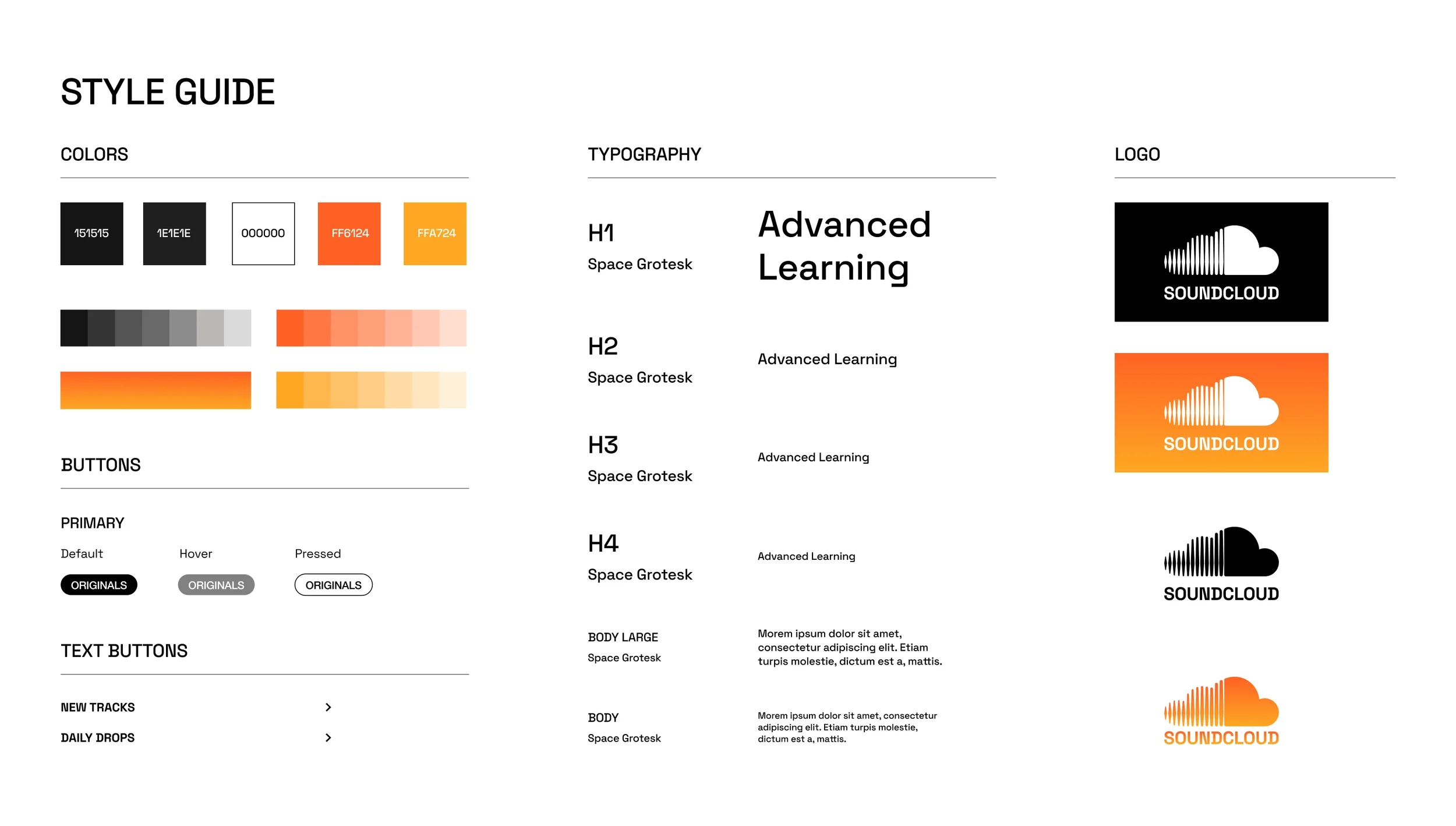
Black-and-white color palette, conveying a bold, modern, more striking, and stripped-back aesthetic.
SoundCloud orange with a slight gradient (orange/yellow) as the accent color, in order to retain a sense of familiarity with their current branding.
Space Grotesk as the new typeface, adding a modern and slick feel, as their current typeface is bland and lacks characteristic.
Larger font size for headings, adding a bold feel to the design, while still feeling tech-oriented and minimalistic.